

This post continues the topic about Advanced Usage of Styled Components and covers more cool styling which you can do with styled components. So, let's start!
In this post Im going to use the same hamburger menu component which I was creating in the previous post. So let's refresh the code: // Menu.js
import {MenuButton, Line, MenuNavigation, NavList, NavItem, NavLink} from "./Menu.styles";
import { useState } from "react";

export const Menu = () => {
  const [display, setDisplay] = useState(false);

  const handleClick = () => {
    setDisplay(!display);
  };
  return (
    <>
      <MenuButton onClick={handleClick}>
        <Line></Line>
        <Line></Line>
        <Line></Line>
      </MenuButton>
      <MenuNavigation displayIt={display}>
        <NavList>
          <NavItem>
            <NavLink href="/">About</NavLink>
          </NavItem>
          <NavItem>
            <NavLink primary href="/">
              Home
            </NavLink>
          </NavItem>
        </NavList>
      </MenuNavigation>
    </>
  );
};
//Menu.styles.js
import styled from "styled-components";

export const MenuButton = styled.div`
  cursor: pointer;
  width: 3rem;
  height: 100%;
  display: flex;
  flex-direction: column;
  justify-content: space-around;
  align-items: center;
`;

export const Line = styled.div`
  width: 80%;
  height: 3px;
  background-color: black;
  margin: 0.2rem;
`;

export const MenuNavigation = styled.div`
  position: fixed;
  width: 200px;
  max-width: 70%;
  height: 100%;
  left: 0;
  margin-top: 1.4rem;
  z-index: 200;
  background-color: white;
  padding: 1rem 2rem;
  transition: all 0.7s ease;
  box-shadow: 0px 8px 30px rgba(0, 0, 0, 0.2);
  display: ${(props) => (props.displayIt ? "block" : "none")};
`;

export const NavList = styled.ul`
  margin: 0;
  padding: 0;
  list-style: none;
  display: flex;
  flex-direction: column;
  align-items: center;
`;

export const NavItem = styled.li`
  margin: 5px 0;
  box-sizing: border-box;
  width: 100%;
  display: block;
`;

export const NavLink = styled.a`
  color: #8f5c2c;
  text-decoration: none;
  width: 100%;
  box-sizing: border-box;
  display: block;
  padding: 0.5rem;
  ${(props) =>
    props.primary &&
    `
    background: green;
    color: white;
  `}
`;
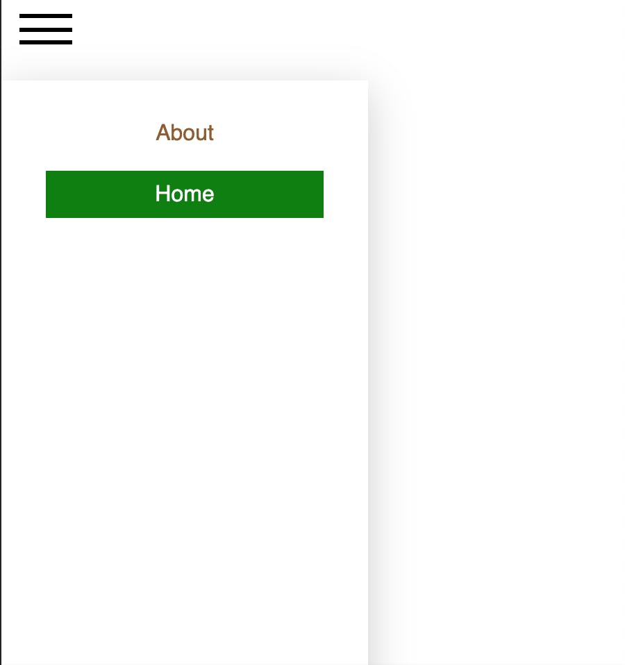
And this is the output - a nice-looking hamburger menu and when we toggle it, we can see the expanded menu sliding out from left side of the page like this:
Hover Effect
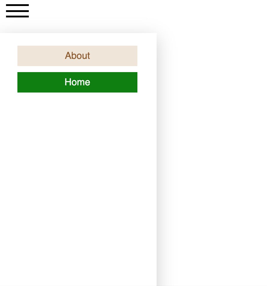
Lets add a hover effect to our menu links, so when we hover over them, the background colour will be different. As you know, we add hover effect by using :hover pseudo-class in CSS. You can use pseudo-classes in styled components right the same way:
:hover {
    background-color: #f0e5d8;
  }
Now our style for links look like this:
export const NavLink = styled.a`
  color: #8f5c2c;
  text-decoration: none;
  width: 100%;
  box-sizing: border-box;
  display: block;
  padding: 0.5rem;
  ${(props) =>
    props.primary &&
    `
    background: green;
    color: white;
  `};
  :hover {
    background-color: #f0e5d8;
  }
`;
And this is the result:
You can use any pseudo-classes like :active, :focus or :visited and many others with styled components (list of the most used pseudo-classes you can find here)
Media Queries
We probably want our Hamburger menu to be visible only on mobile devices. So we can add a media query to the MenuButton styles like this:
@media screen and (min-width: 500px) {
    display: none;
  }
So, as you can see, media queries are working as well in a usual way with styled components.
Using Classes
What if we want to style a particular element by using className attribute? We can do that! But here comes a tricky part :)
Let's consider we want to style our menu links using className attribute. We have added blu and red classes to them:
 <NavList>
   <NavItem>
     <NavLink className="blue" href="/"> About </NavLink>
   </NavItem>
   <NavItem>
     <NavLink primary href="/"> Home </NavLink>
   </NavItem>
   <NavItem>
     <NavLink className="red" href="/"> Contact </NavLink>
   </NavItem>
 </NavList>
We can access those classes from styled components in 2 ways:
- Using
.selector with a class name This approach can be used only on the parent element to target its child element. It refers to the child element of the component. So, to target one of our links - NavLink - we need to use class selector in its parent - NavItem:
export const NavItem = styled.li`
  margin: 5px 0;
  box-sizing: border-box;
  width: 100%;
  display: block;

 .blue {color: blue;} <- this is our NavLink with class Blue
`;
Now one of our links has blue colour:
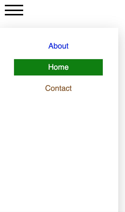
2.Using & selector together with . and class name
This approach lets us target the className of the main component itself, so we can target Red class from NavLink:
export const NavLink = styled.a`
  color: #8f5c2c;
  text-decoration: none;
  width: 100%;
  box-sizing: border-box;
  display: block;
  padding: 0.5rem;
  ${(props) =>
    props.primary &&
    `
    background: green;
    color: white;
  `};
  :hover {
    background-color: #f0e5d8;
  }
  &.red { <- this is out NavLink with class Red
    background: red;
  }
`;
And now our link has red background color:
![hamburger_menu_classes_1.png] (cdn.hashnode.com/res/hashnode/image/upload/..)
Ampersand & is pretty important selector in styled components. It can be used to increase the specificity of rules on the component; this can be useful if you are dealing with a mixed styled-components and vanilla CSS environment where there might be conflicting styles.
If you look now at hover effect of NavLink with class red, you can see that it's gone. That is because & has higher specificity over tags styles. To get the effect back, we need to add it inside the & block of code:
&.red {
    background: red;
    :hover {
      background-color: #f0e5d8;
    }
  }
Now we have hover effect back:

Phew that was a lot we have explored today! I hope you learned something new together with me :) But its not all what we can do with styled-components. To be continued...
P.S. You can find the link to the project HERE if you need it.
Thank you for reading my blog. Feel free to connect on LinkedIn or Twitter :)