Responsive Website using CSS Grid

I am web developer / front-end engineer from Germany. My stack includes:
- HTML and CSS (including SASS, Tailwind, MaterialUI, Bootstrap)
- JavaScript
- ReactJS
- WordPress
- Git
This blog post describes one of the websites I have built using a powerful tool for building responsive websites - CSS Grid layout.
I have watched WesBos tutorial while I was learning Grid and practiced it afterwards (which is a good way of study for me).
Page Content and Layout
The page content is pretty simple here:
divwith a classwrapper- main wrapping layout element<div class="wrapper">- Inside the wrapper there is
divwith a classtop- this element is responsible for the content on the top of page:<div class="top"> Inside the top there are
header, 2 call-to-actionsdivareas to the right of the main image:<header class="hero"> <div class="call-to-action call-to-actiont-1"> <div class="call-to-action call-to-actiont-2">After top there is
navelement for the menu:<nav class="menu">Inside the menu navigation there are
buttonandulelements. We createbuttonhere to be able to toggle it and expand/ collapse the menu. Menu-list element contains links of different dishes in the menu:<button aria-expanded="false" aria-controls="menu-list"> <ul id="menu-list">Inside the wrapper after menu class there are 3 sections:
<section class="features">
<section class="about">
<section class="gallery">
There are 4
divelements inside features section, they describe Tacos, Beer, Wine and Music:<div class="feature">- About section contains info about Featured Taco and gallery section contains images.
Every HTML block of code was styled using CSS Grid layout. The most frequently used CSS properties in this project were:
display: gridgrid-gapgrid-template-areasgrid-template-columns
For example:
.features{
    display: grid;
    grid-gap: 20px;
    grid-template-columns: repeat(auto-fit, minmax(200px, 1fr));
}
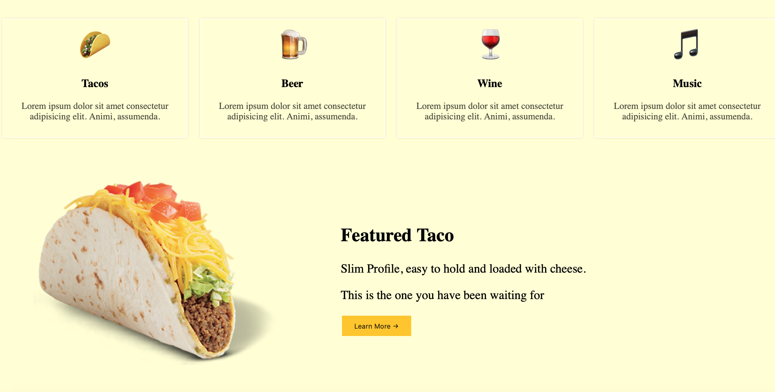
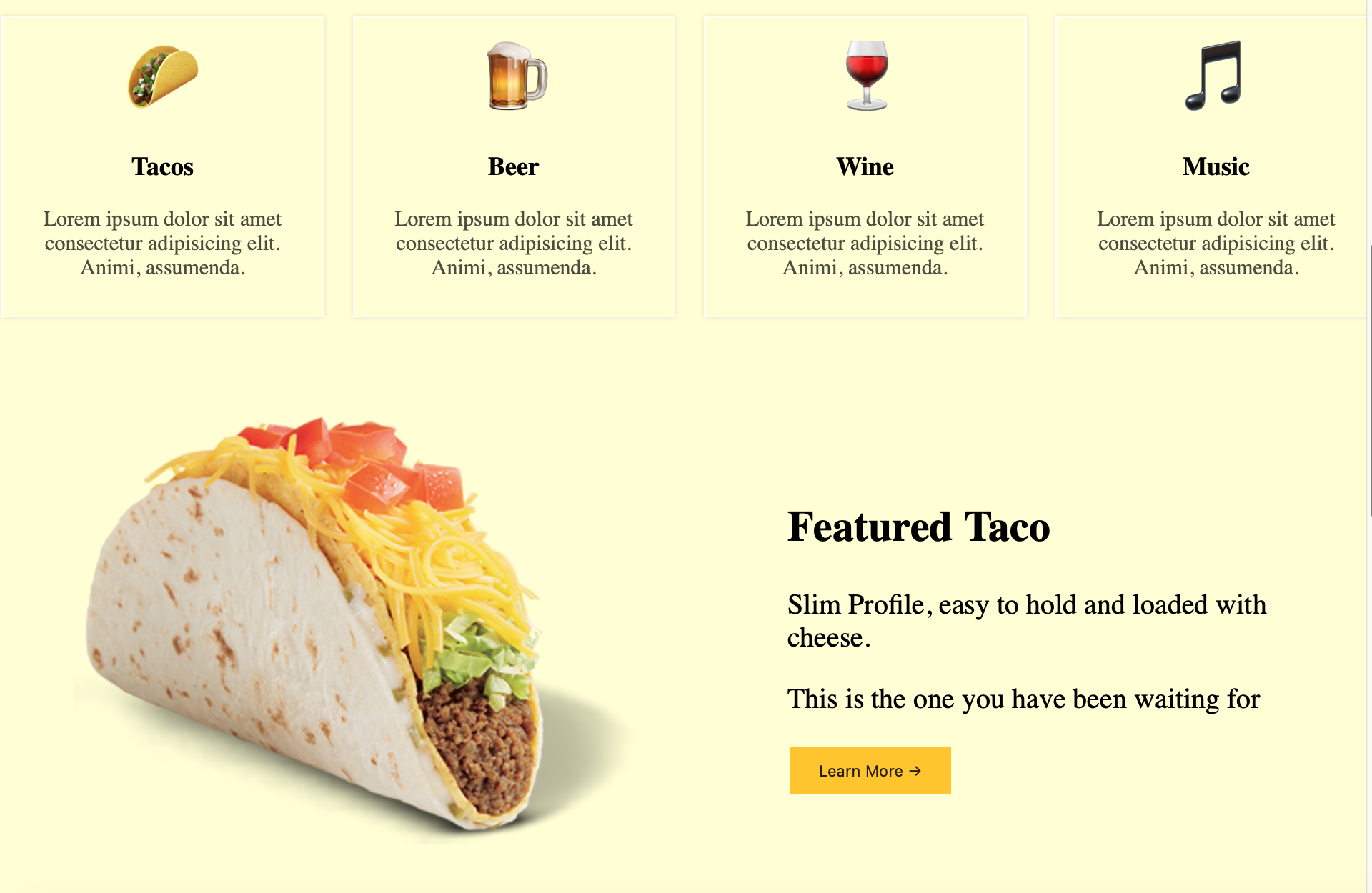
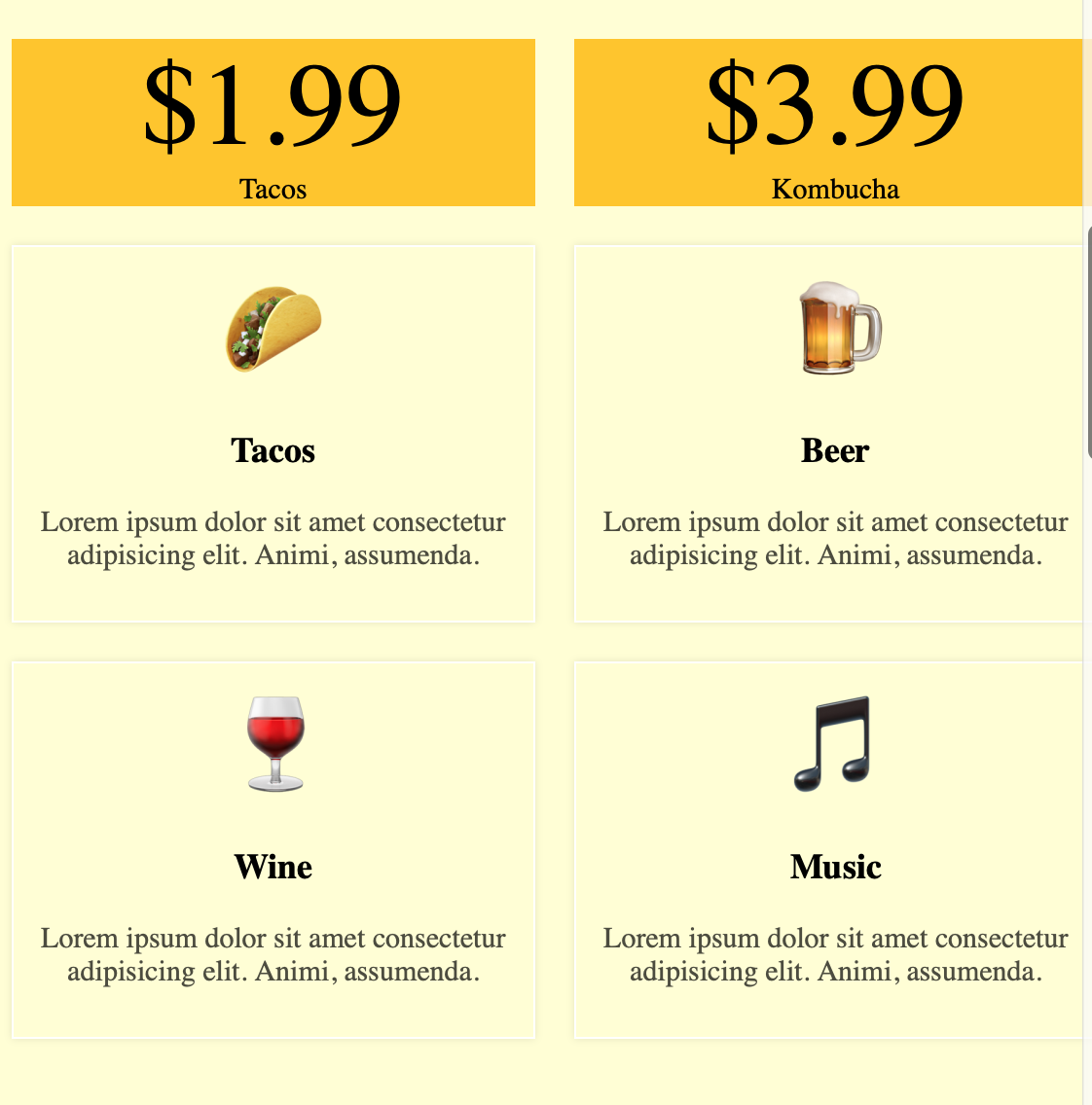
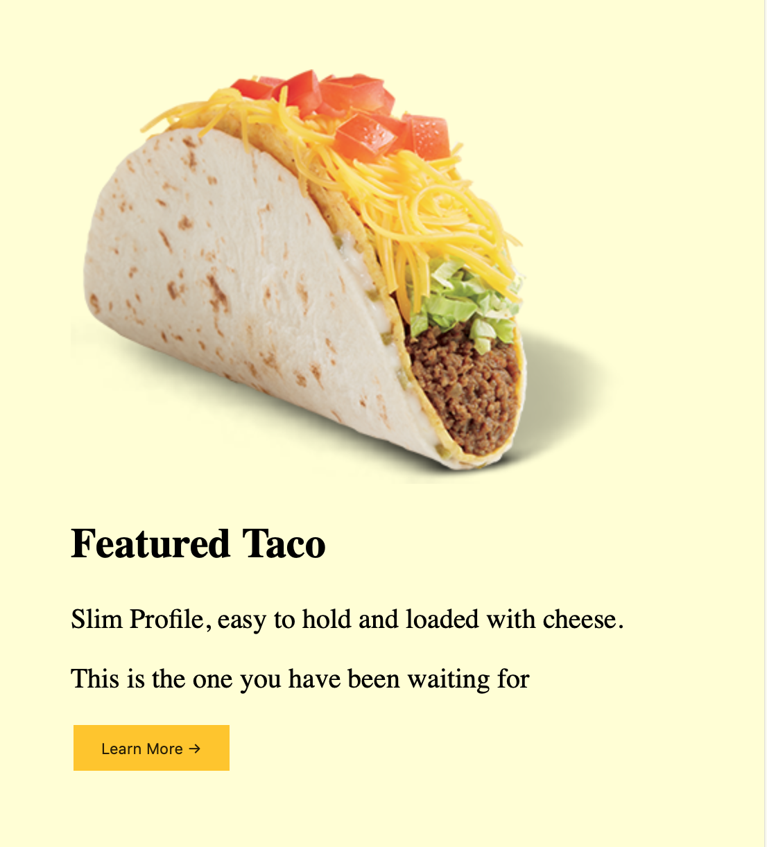
Website is fully responsive, we use here @media queries to re-arrange the page layout according to width. See pictures below for desktop, tablet and mobile versions.
Desktop Version


Tablet Version
On tablet version Menu collapses and only Menu button is shown. Also the layout of the page is being changed:

This image demonstrates Menu section when a user toggles Menu button:


Mobile Version


Thank you for reading my blog. Feel free to connect on LinkedIn or Twitter :)